Jotun Colour Academy: A Day Inside the Language of Colour
Jotun Colour Academy: A Day Inside the Language of Colour
Aug 20, 2026
Jotun Colour Sheet
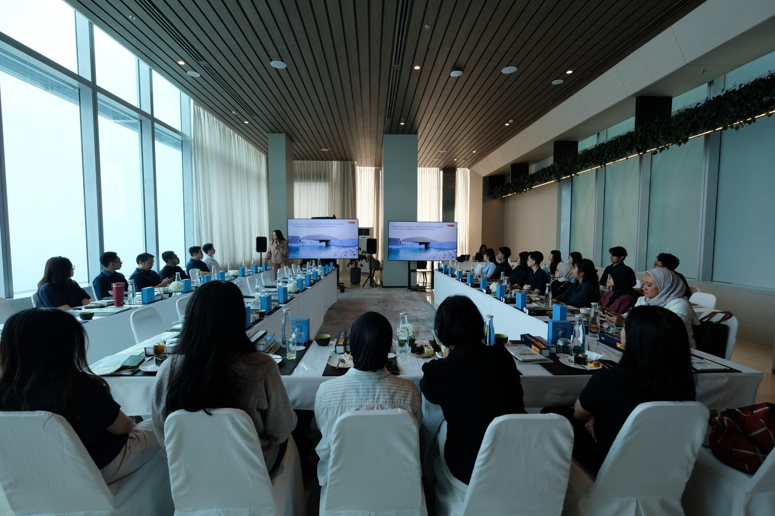
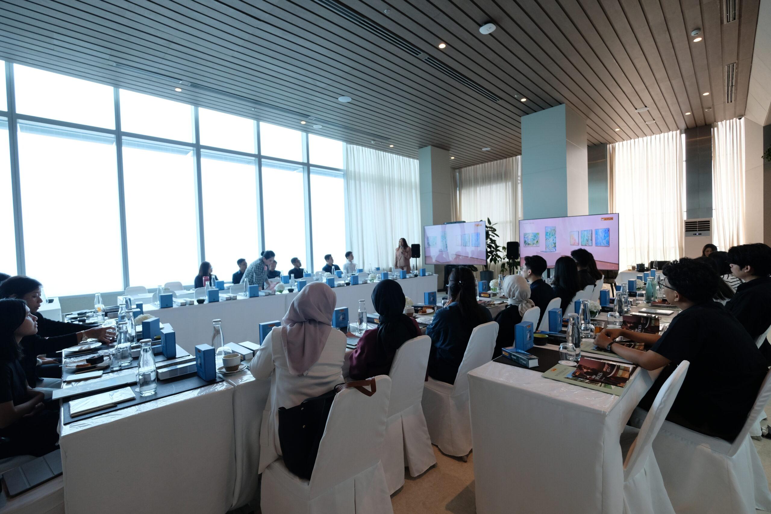
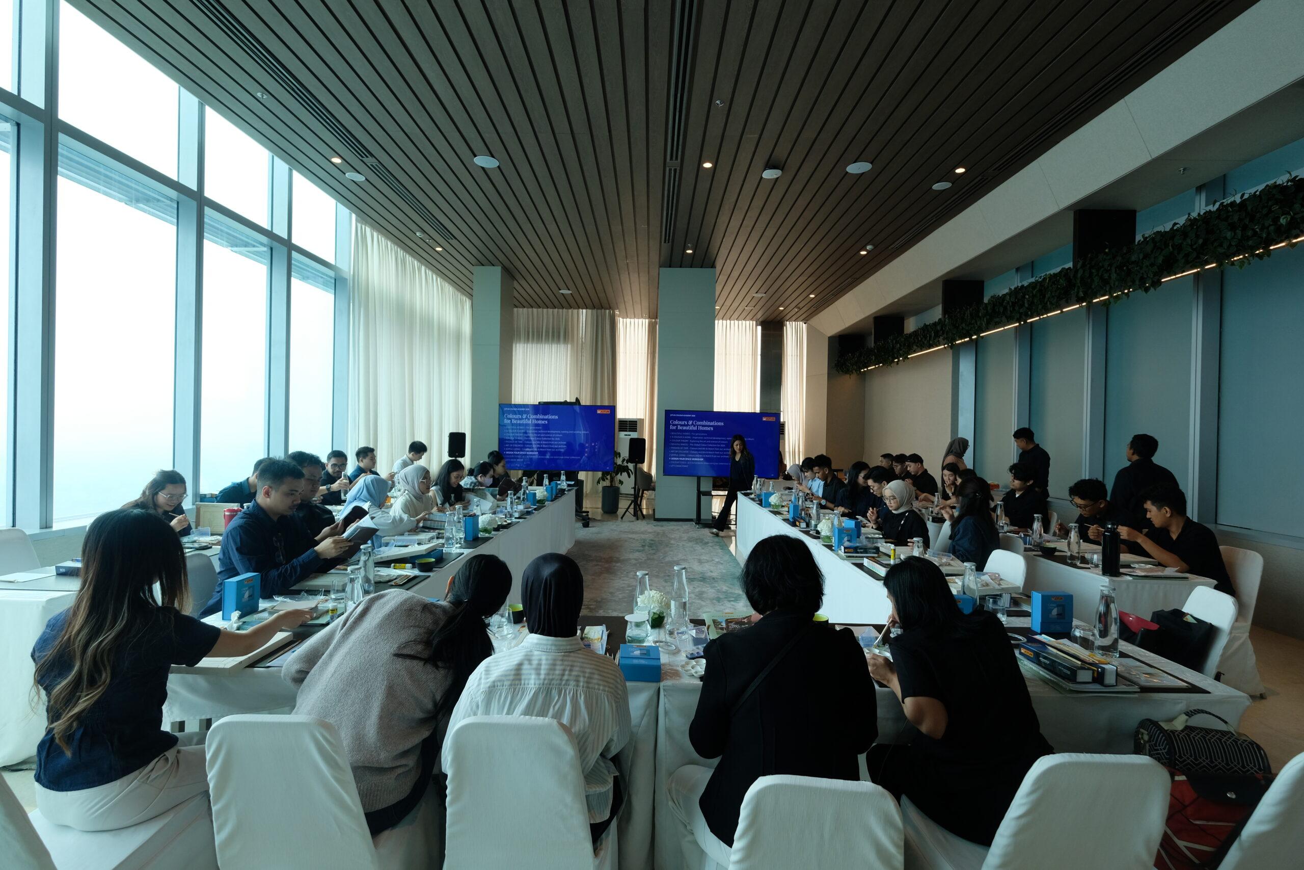
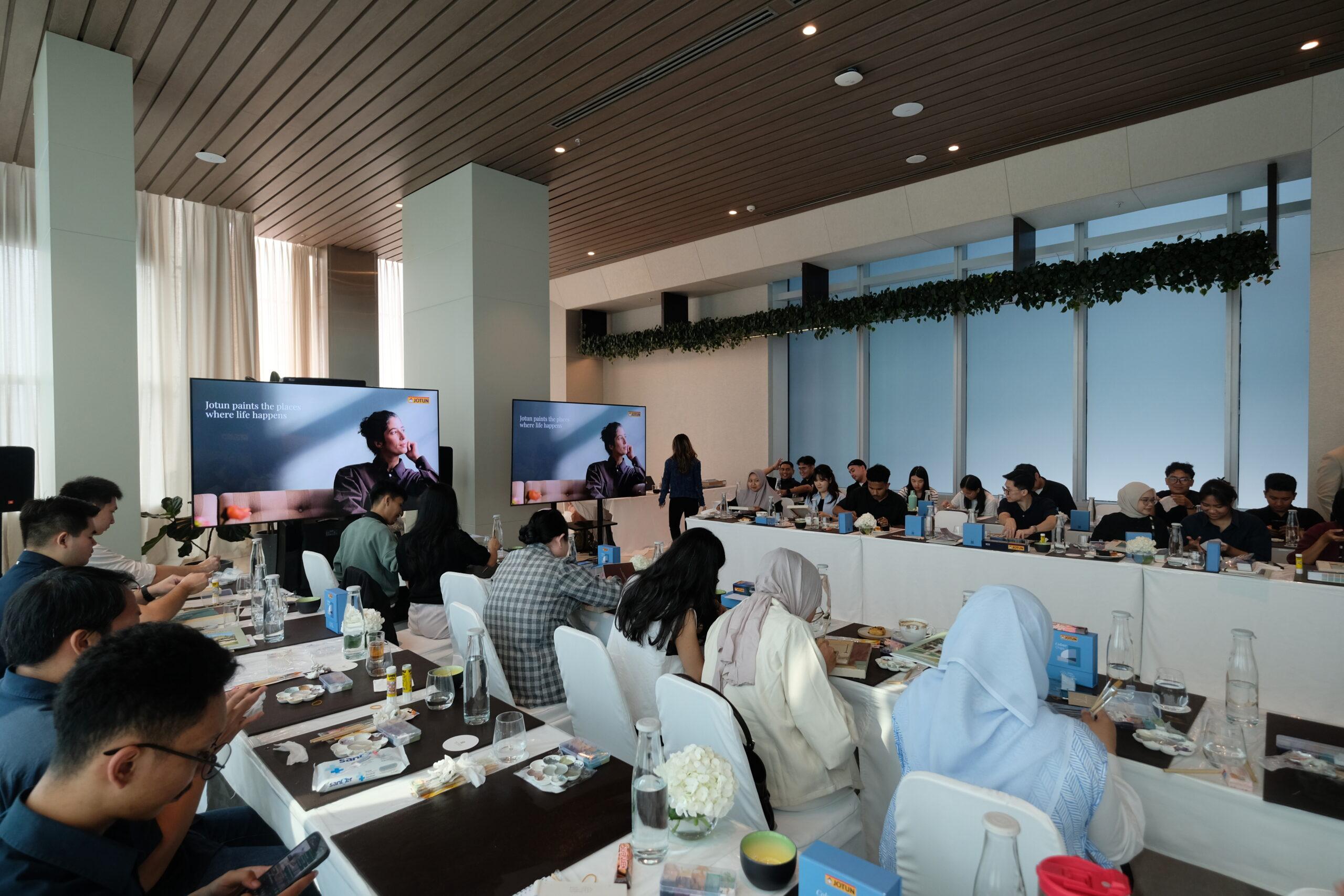
Inside the Pacific Club Lounge, Thamrin Nine, Pan Pacific Jakarta, architects, interior designers, and colour enthusiasts settled in for Jotun Colour Academy 2026 — an eight-hour journey into everything a can of paint quietly holds.
Natrah Omar
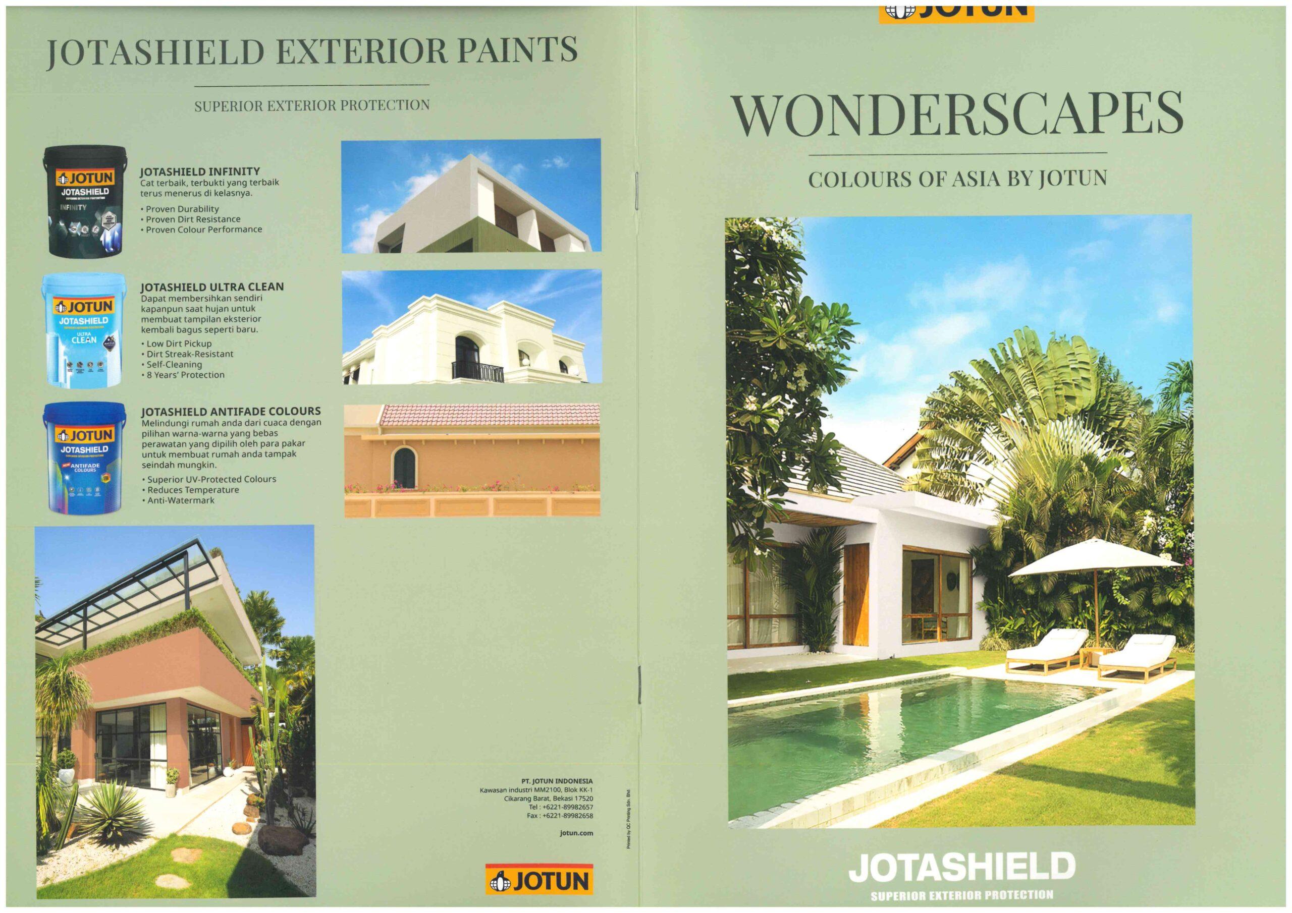
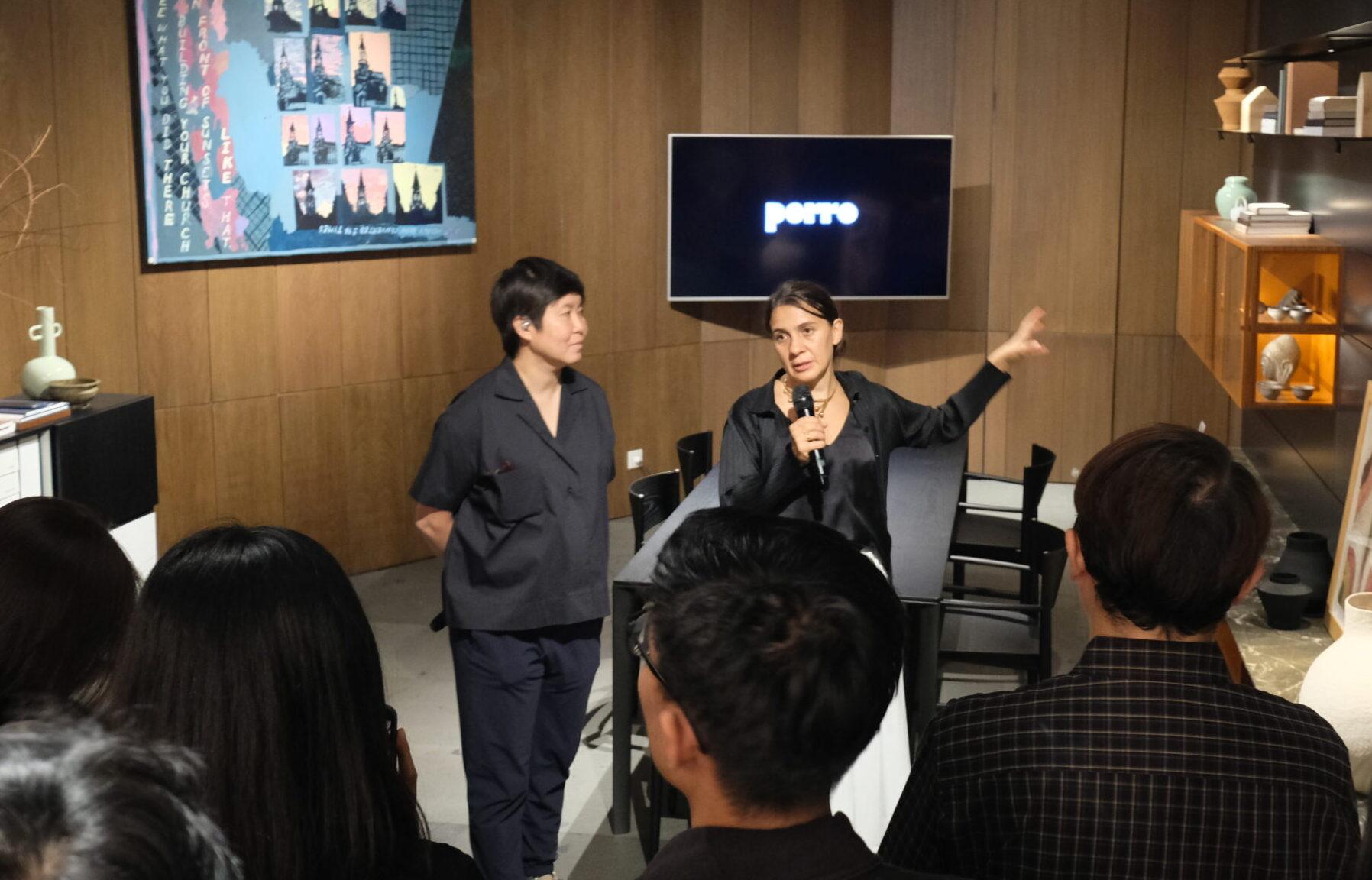
The morning opened with fundamentals: a walkthrough of Jotun’s interior finishes and Jotashield exterior technology, built to withstand the tropics without losing its colour. Then Natrah Omar, Jotun’s Regional Colour Marketing Manager for South East Asia and Pacific, turned the conversation toward something less obvious — the psychology hiding inside every shade. Why does red command a room while blue settles it? Why does yellow lift a mood the way sunlight does, while black, often mistaken for heaviness, can lend quiet strength instead? Neutrals, she explained, are never truly neutral — they are the negotiators between bolder statements — and green will always borrow its calm from nature itself.
Natural Colour System
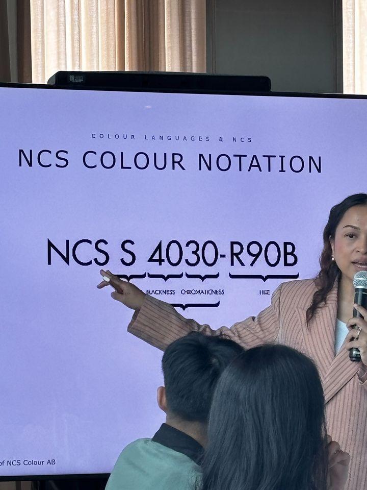
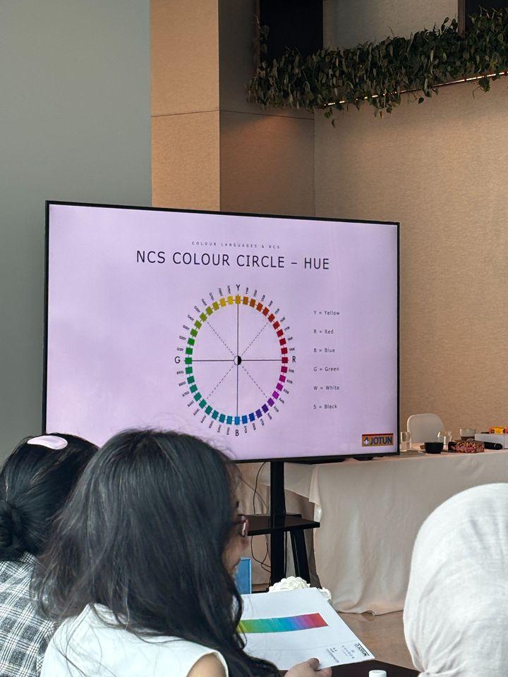
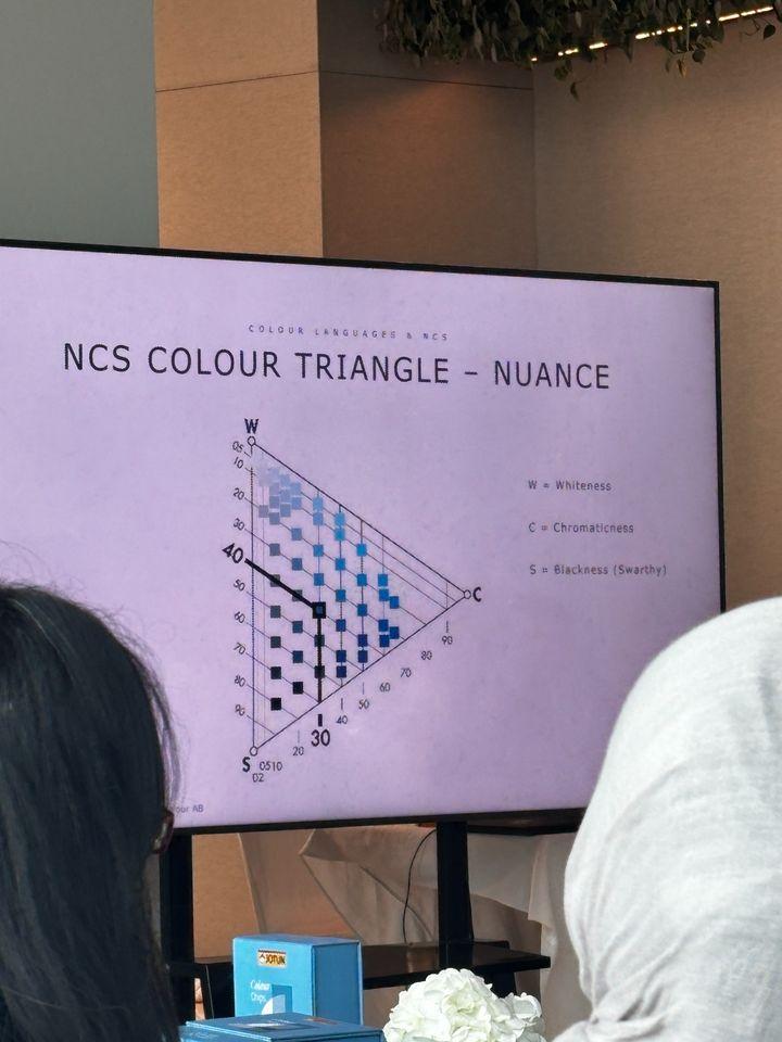
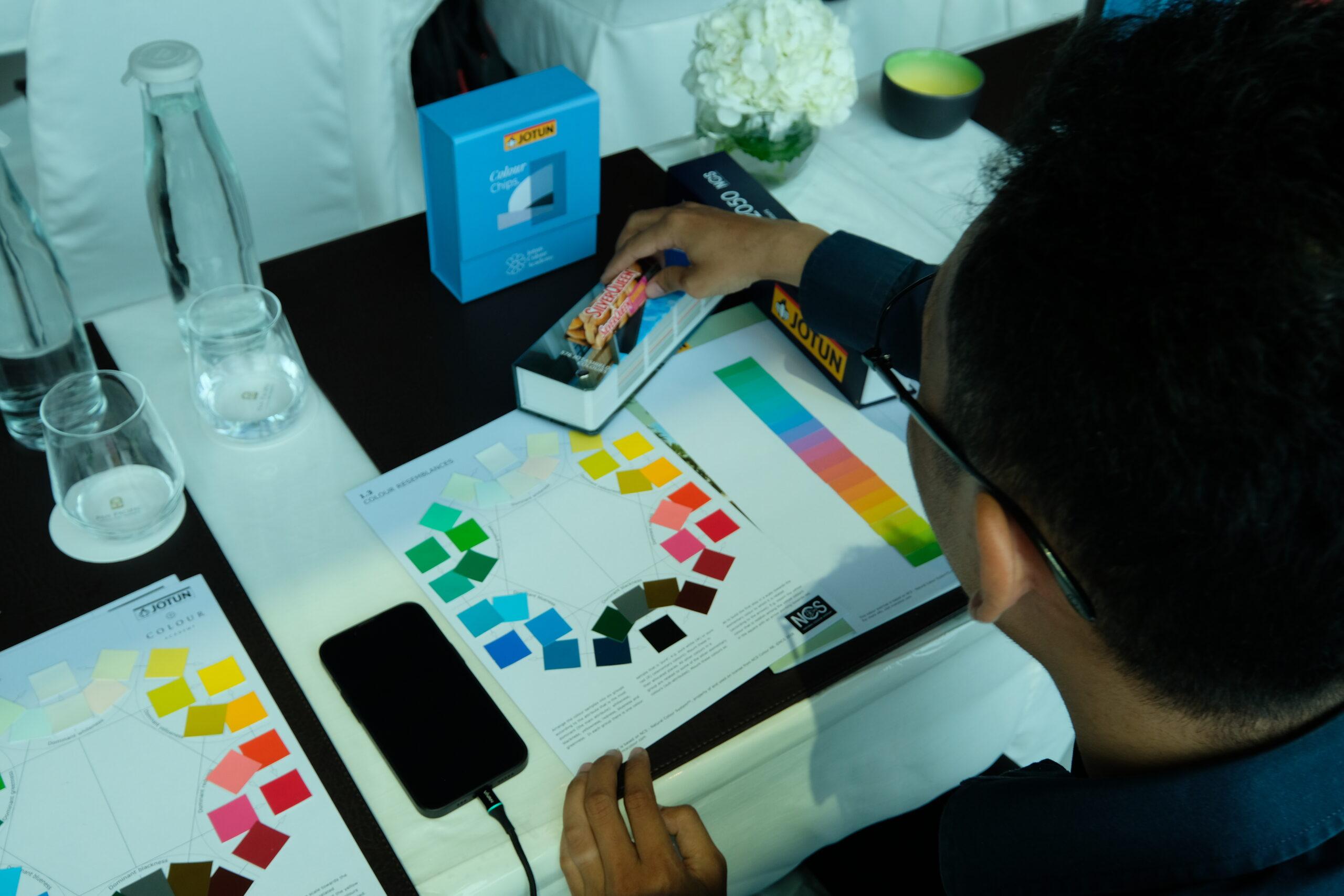
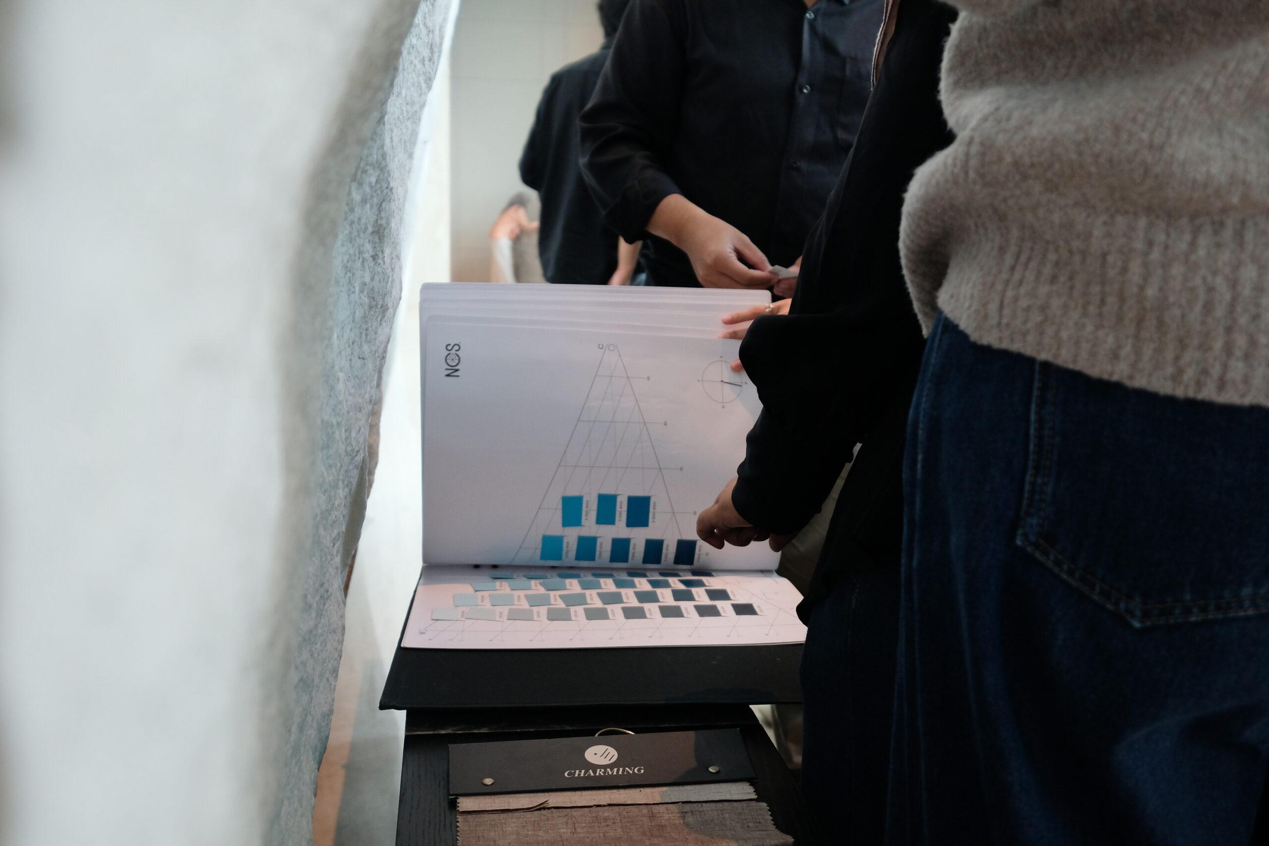
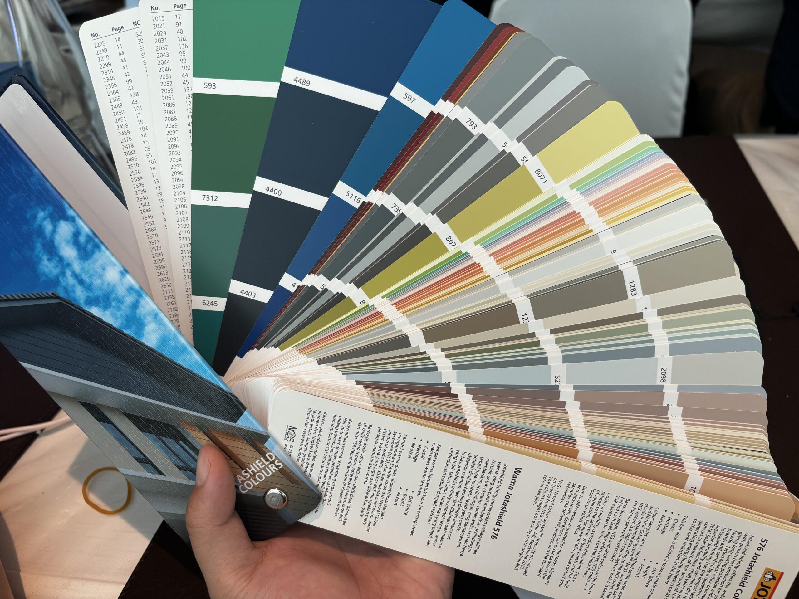
That philosophy, it turns out, rests on real science. Where most industries describe colour through RGB or CMYK, Jotun speaks the Natural Colour System, or NCS — a Swedish-built language of six elementary sensations: white, black, yellow, red, blue, and green. A code like NCS S 4030-R90B isn’t arbitrary; it spells out exactly how much blackness, chromaticness, and hue live inside that particular tin. Just as important is what happens after mixing: Jotun formulates its shades with unique recipes and rigorous testing to ensure stability and accuracy across multiple lighting conditions, though they recommend physical testing as natural light, lamps, and surroundings still alter how a color appears.
Wonderscapes: Colour of Asia by Jotun
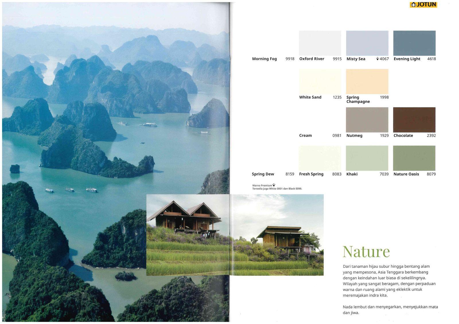
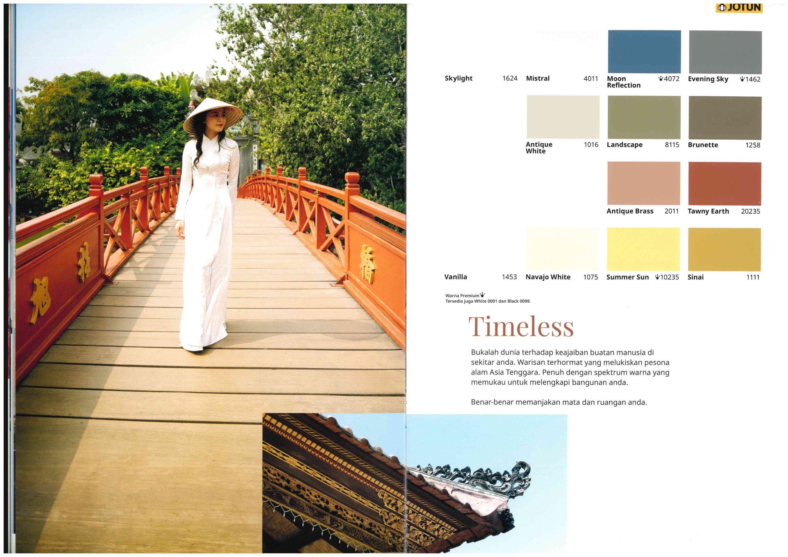
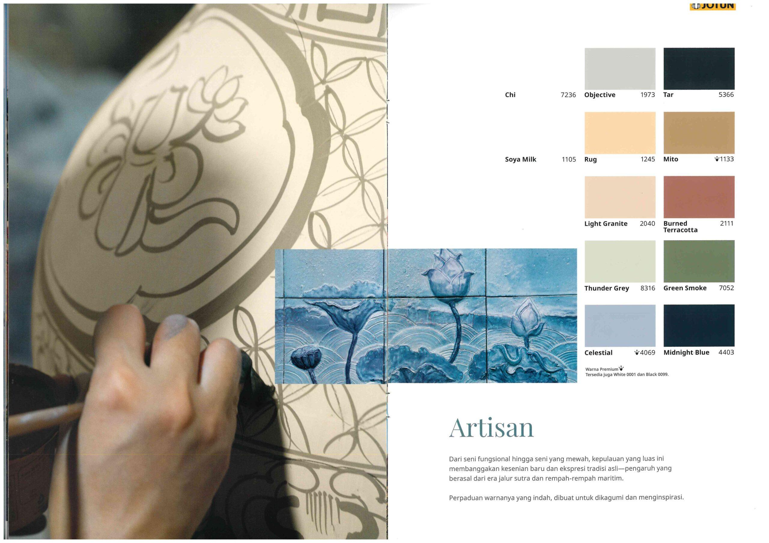
Three inspirations anchor the 2026 palette — Nature, Timeless, and Artisan — while five principles guide how to pair them: monochromatic, neighbouring tones, complementary colour, contrast, and same nuances, each quietly printed on the back of every colour sheet.
NCS wheel & Exercise
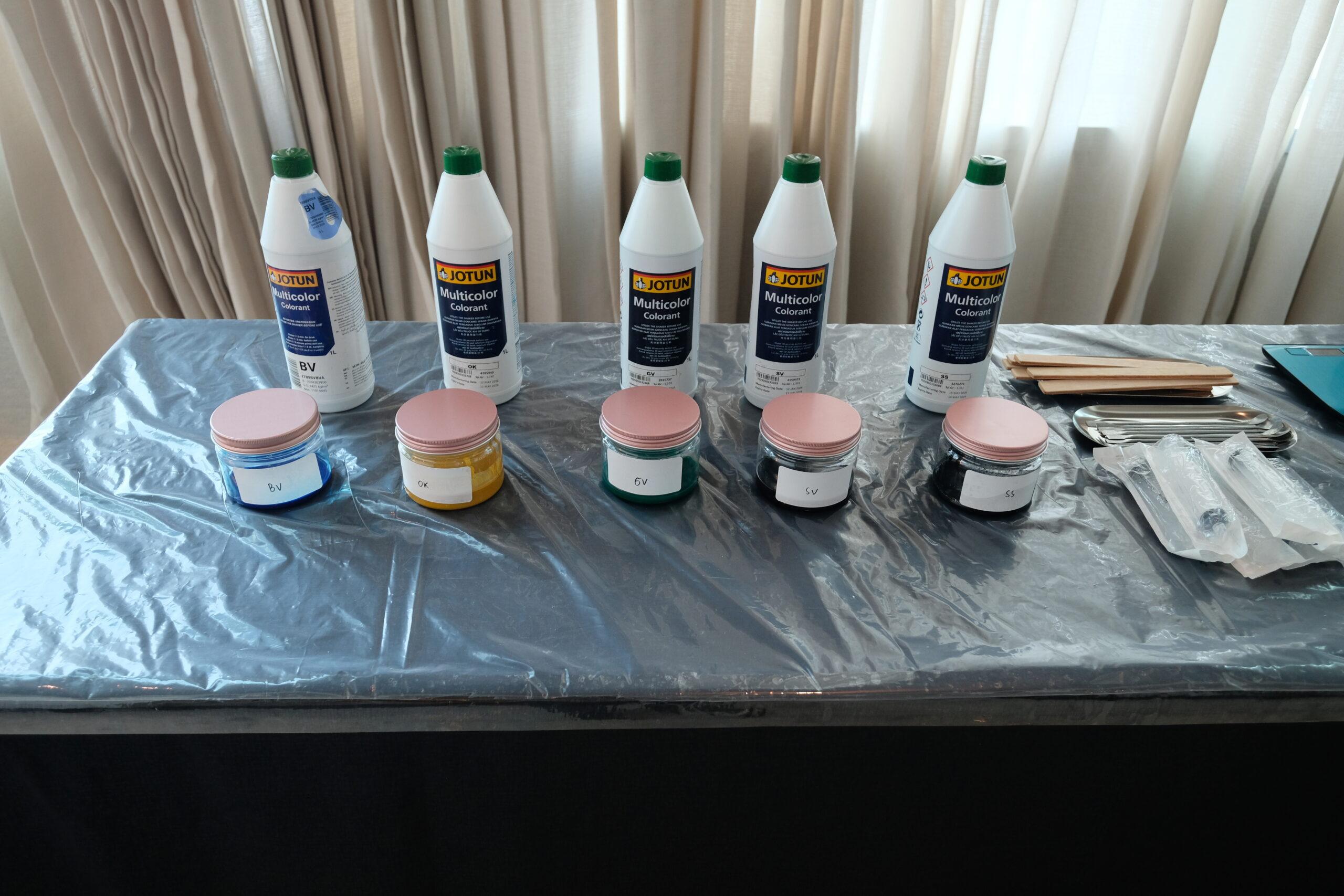
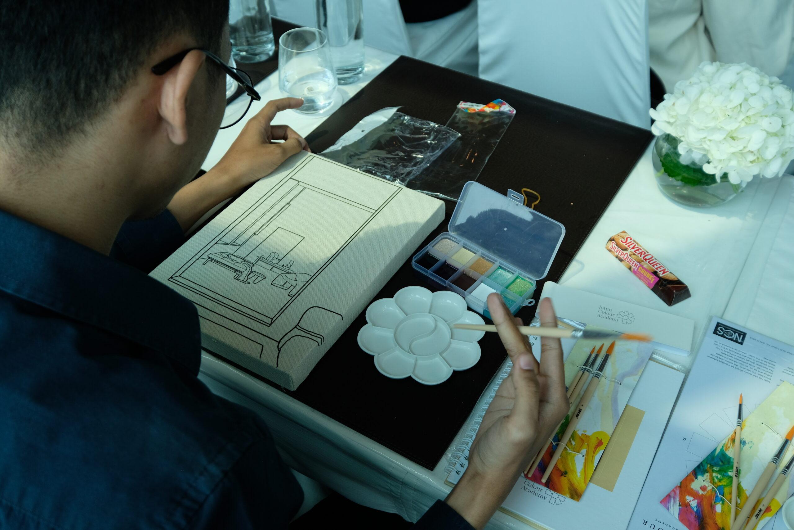
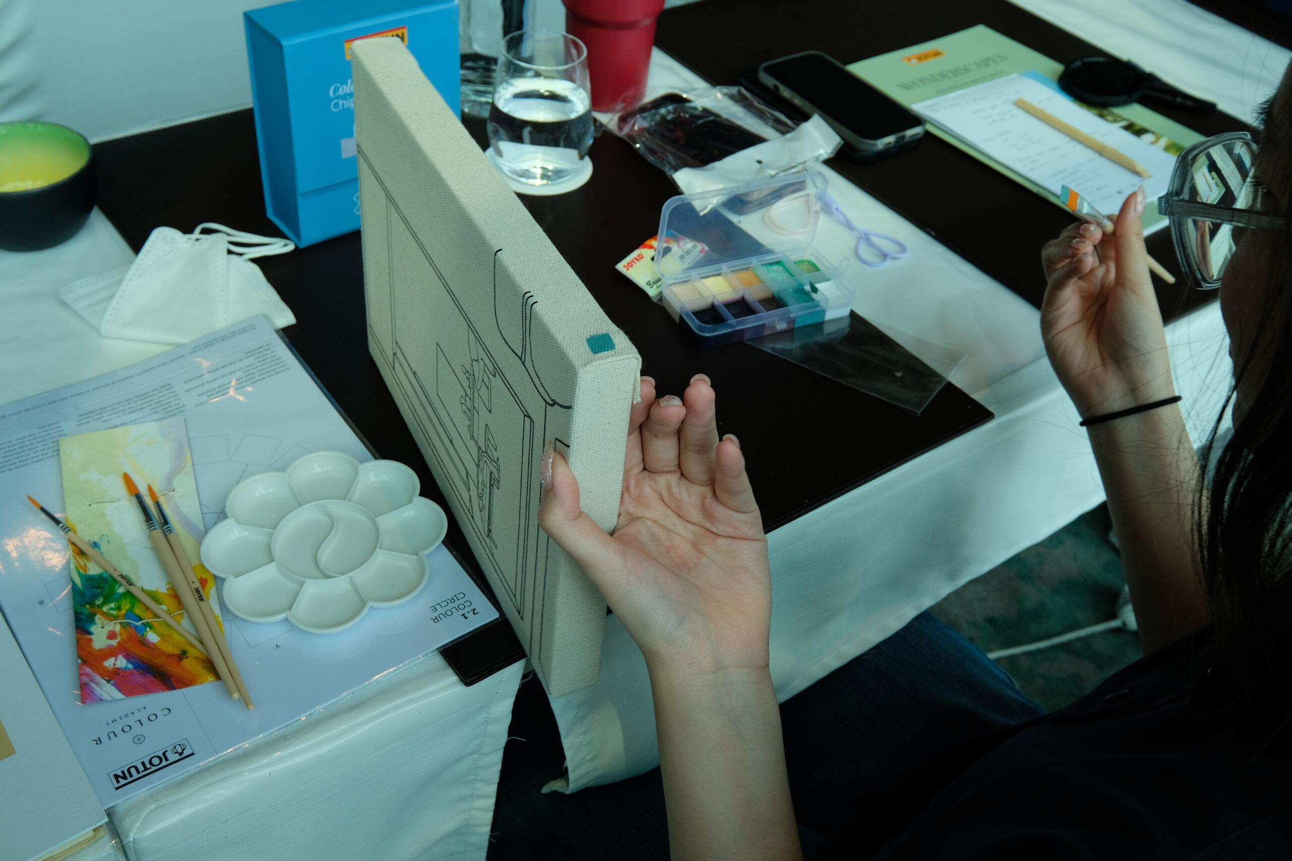
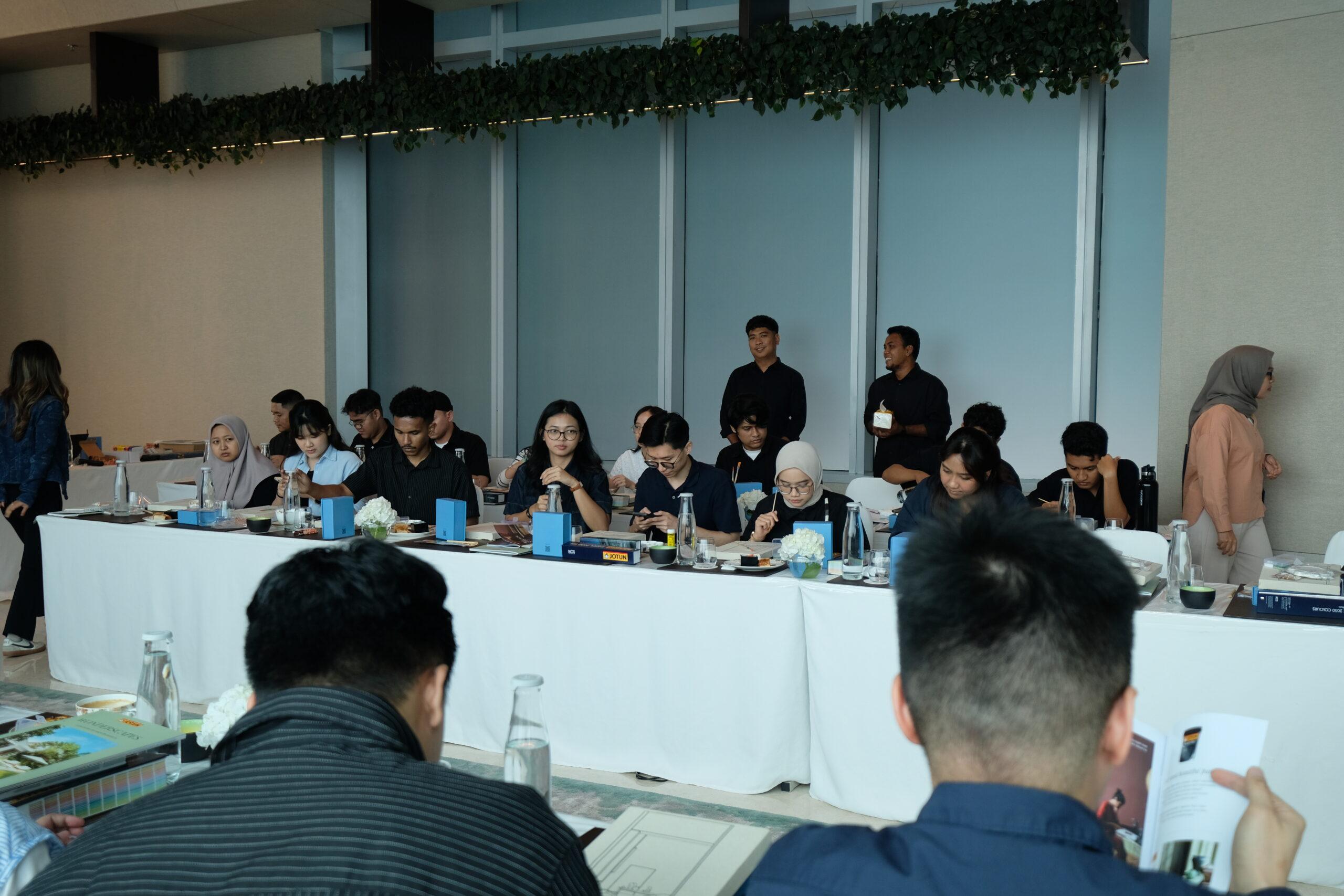
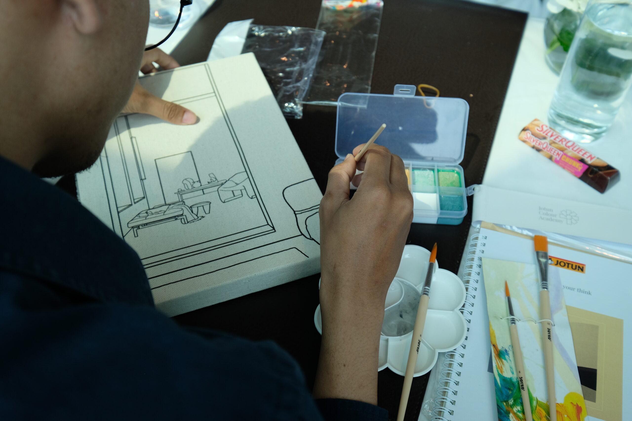
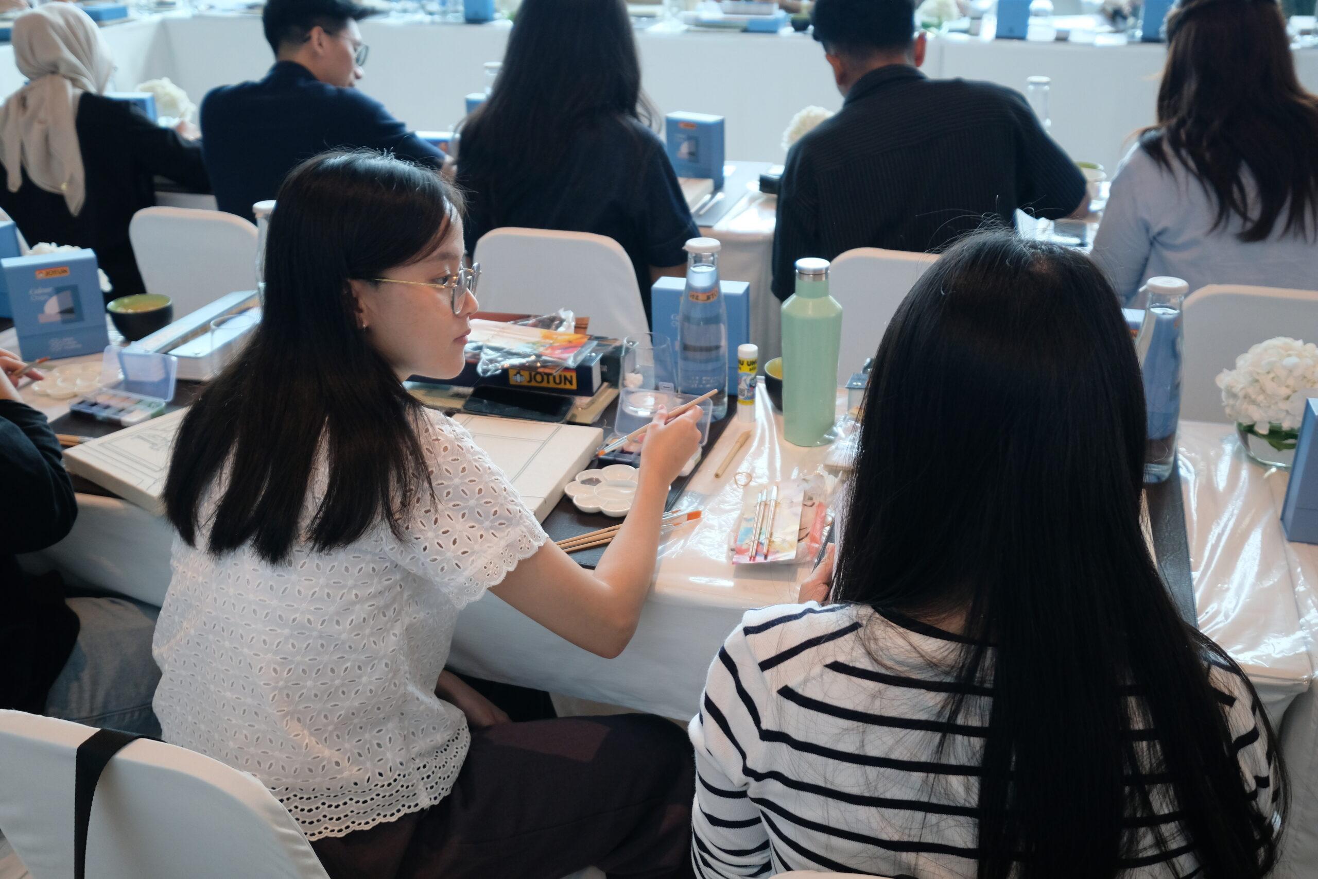
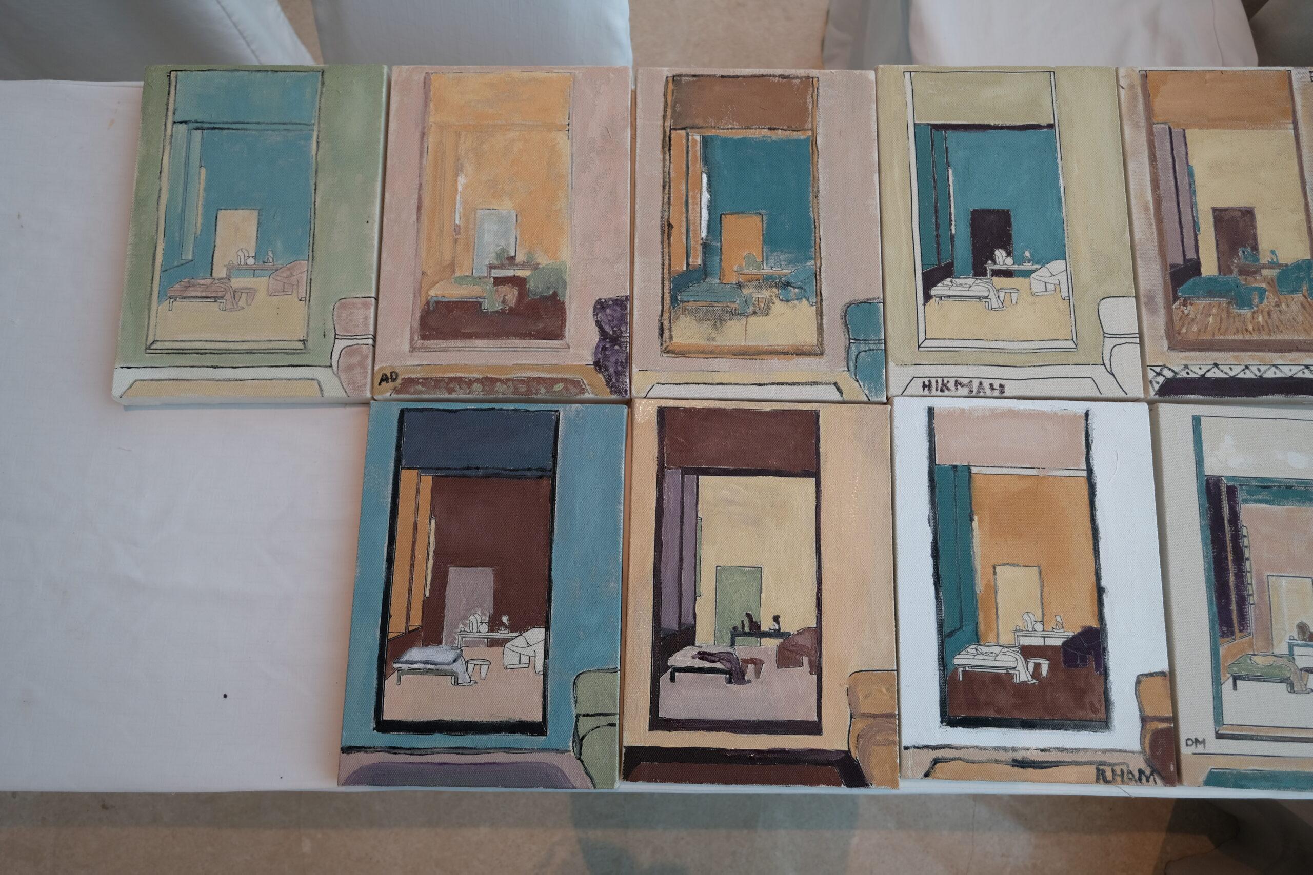
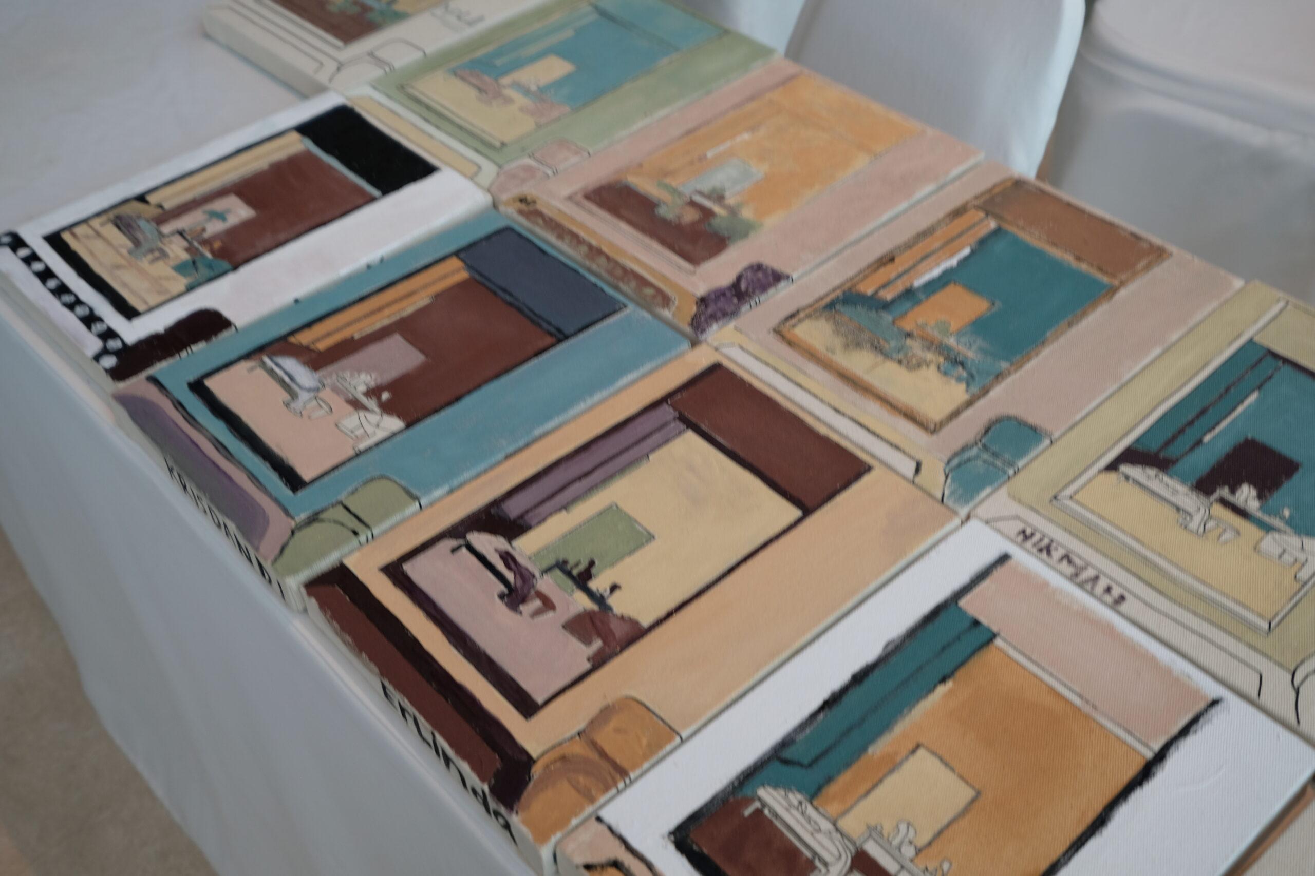
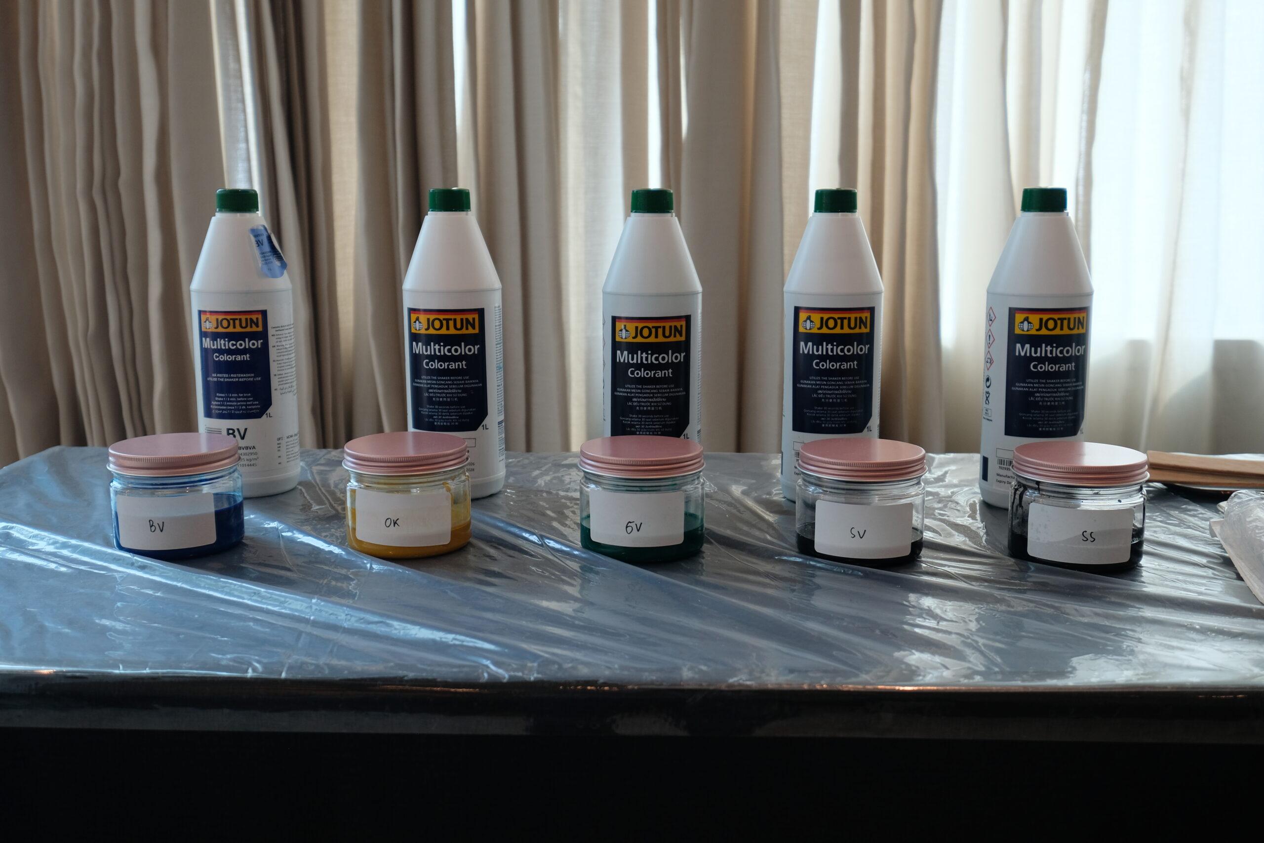
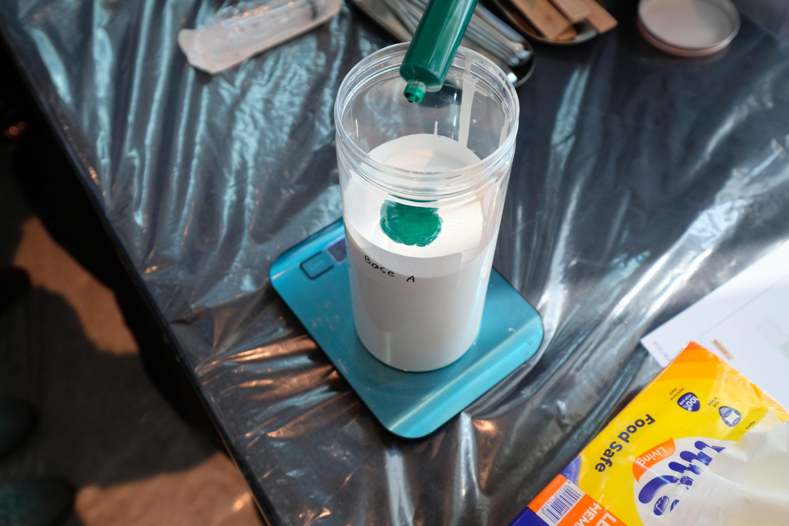
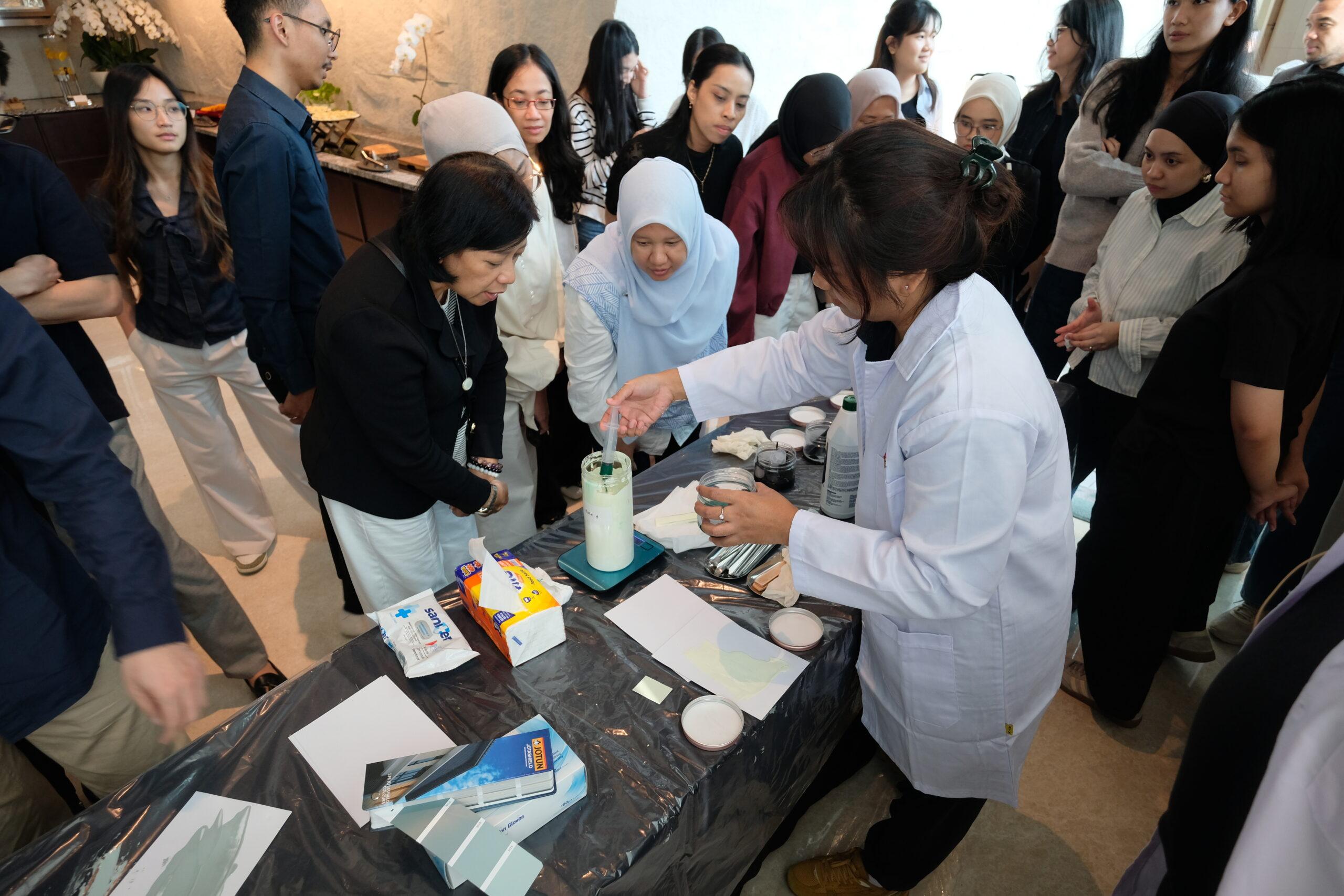
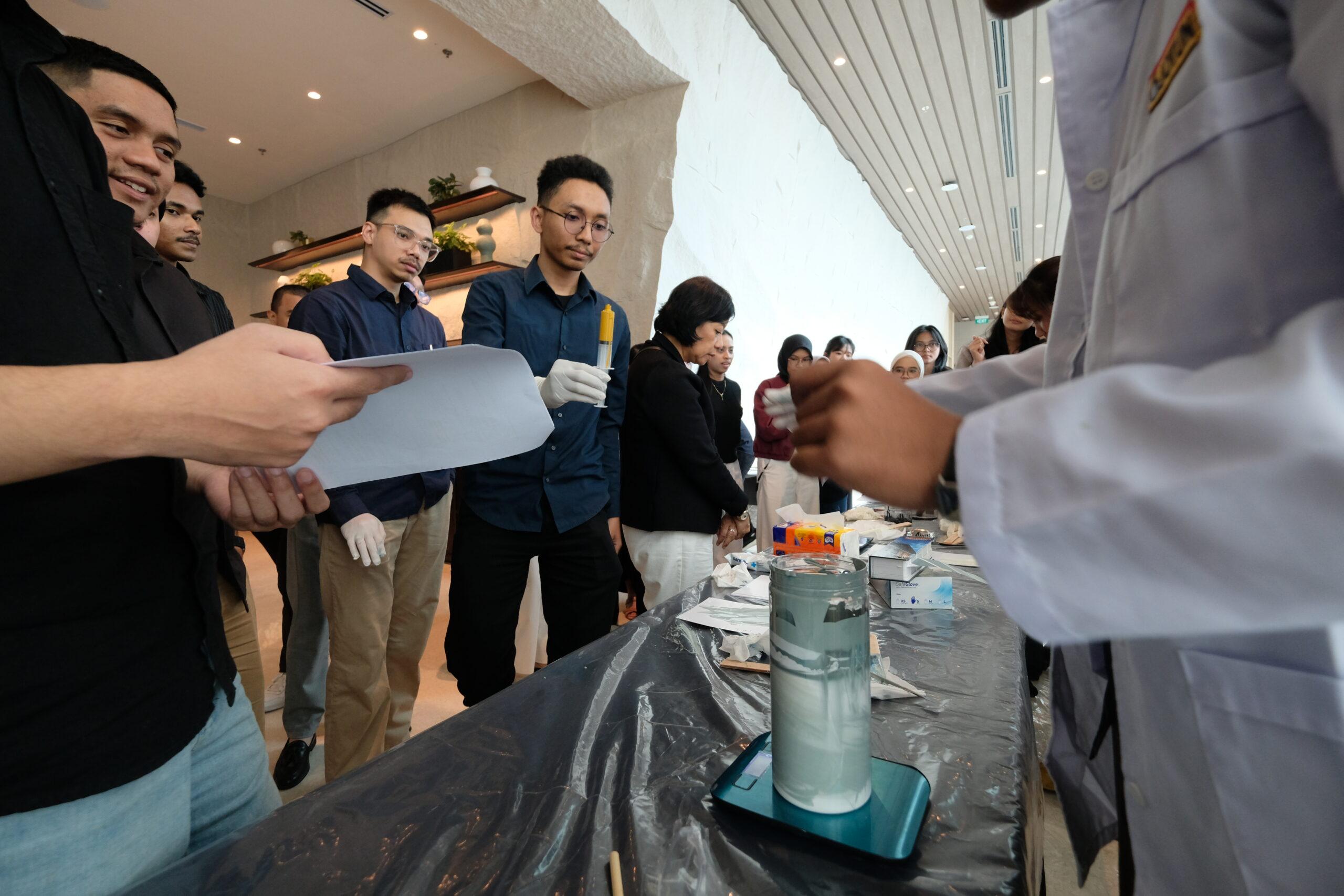
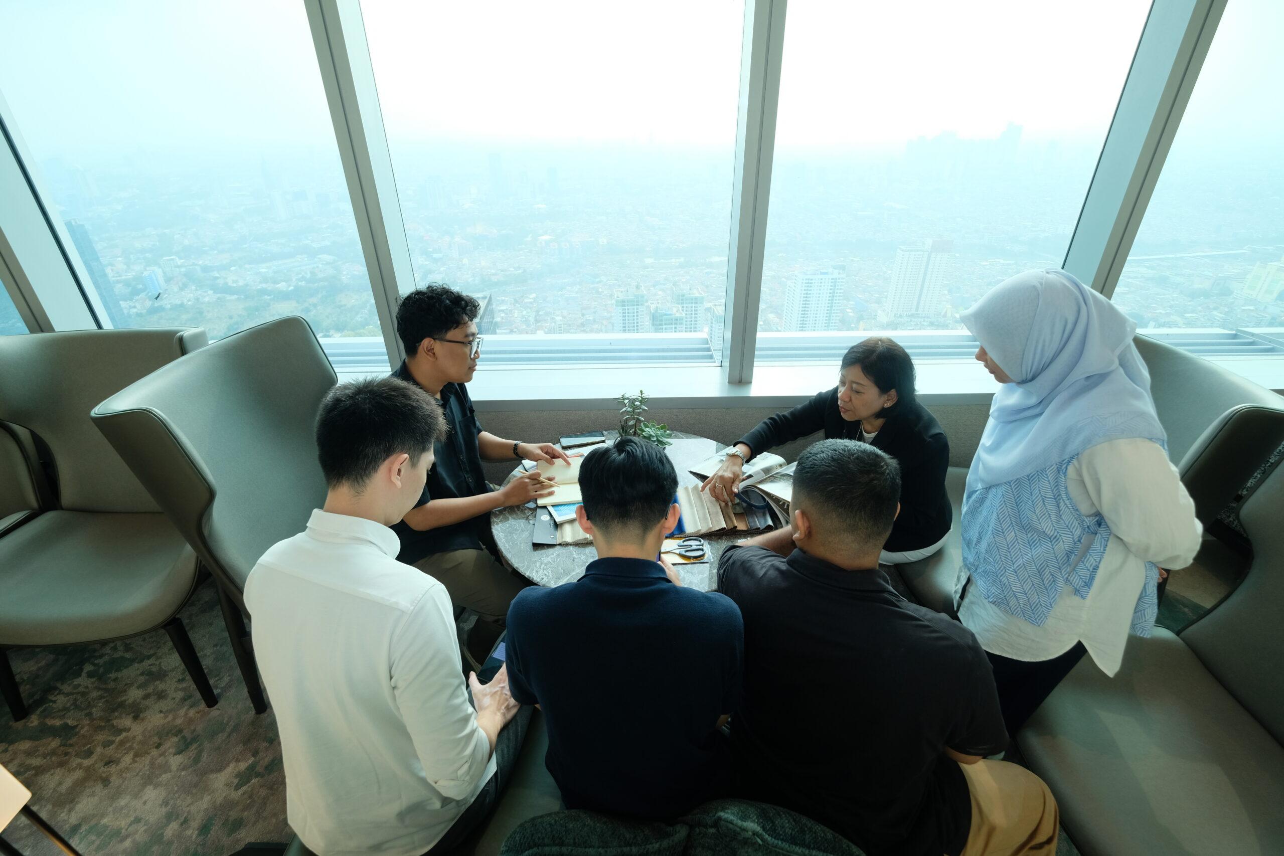
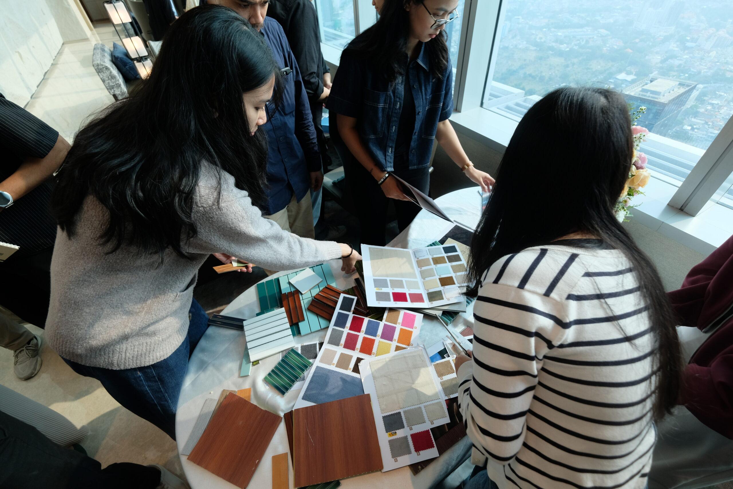
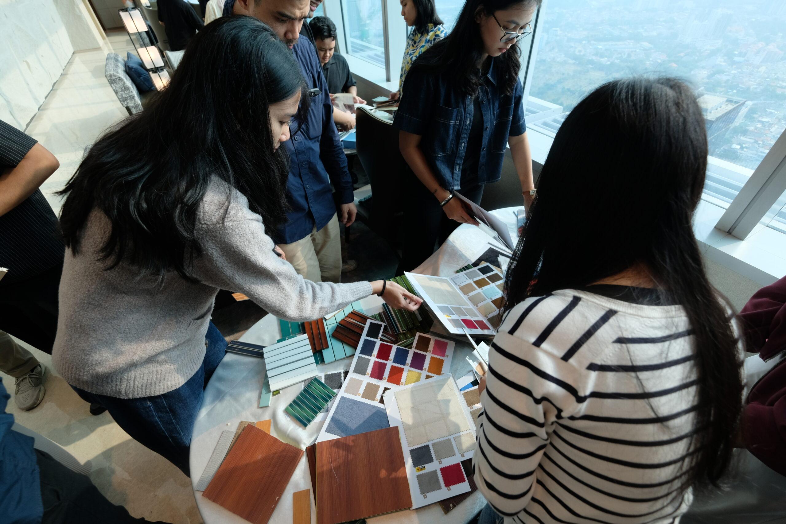
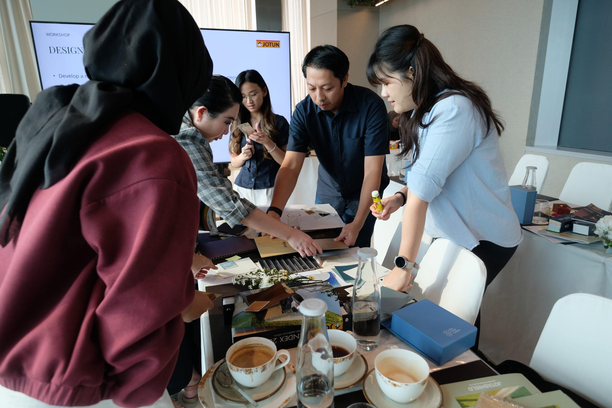
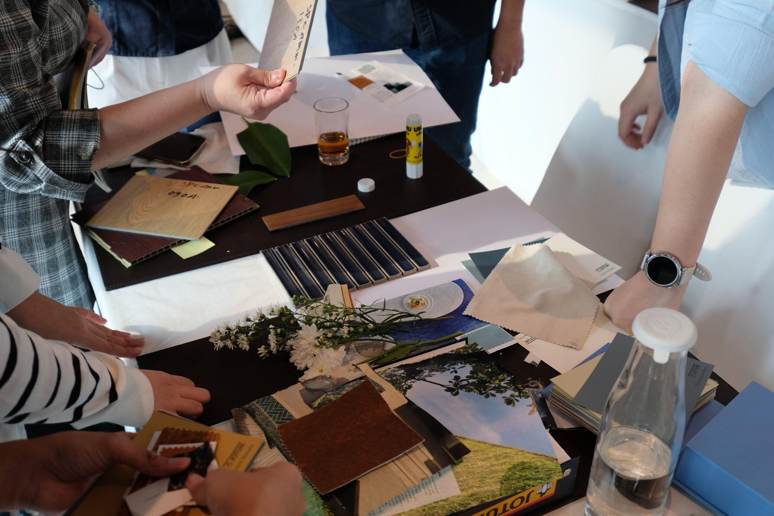
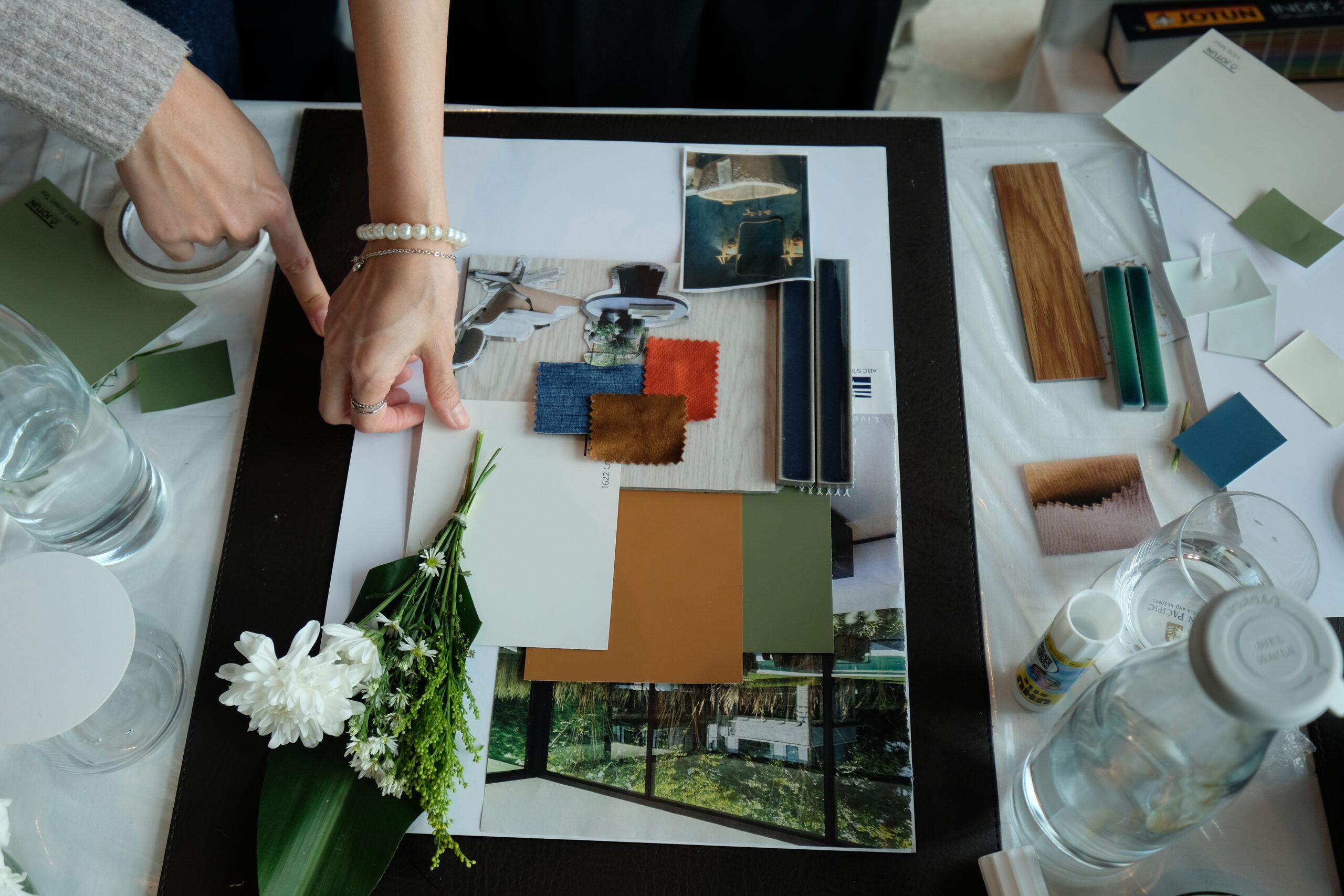
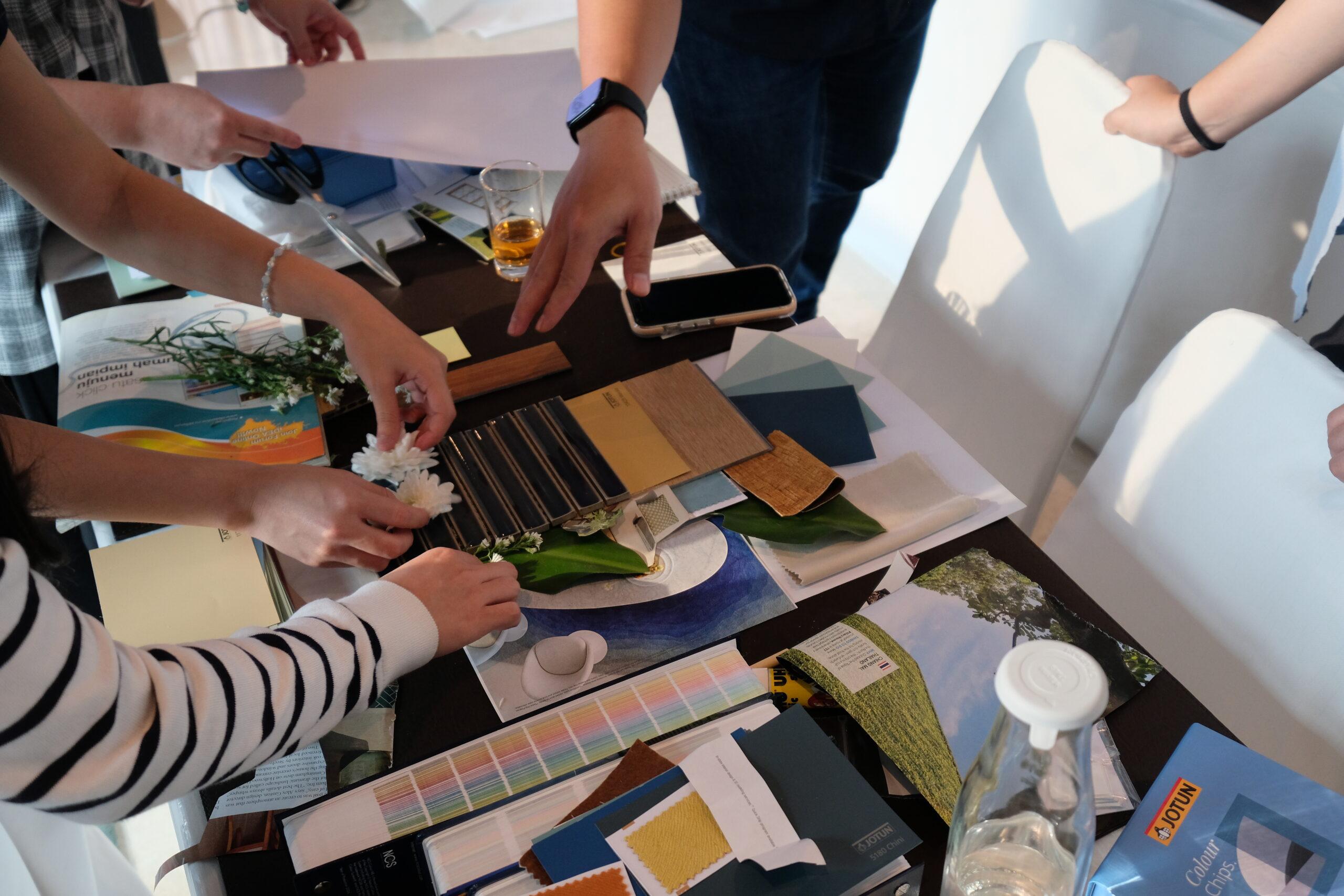
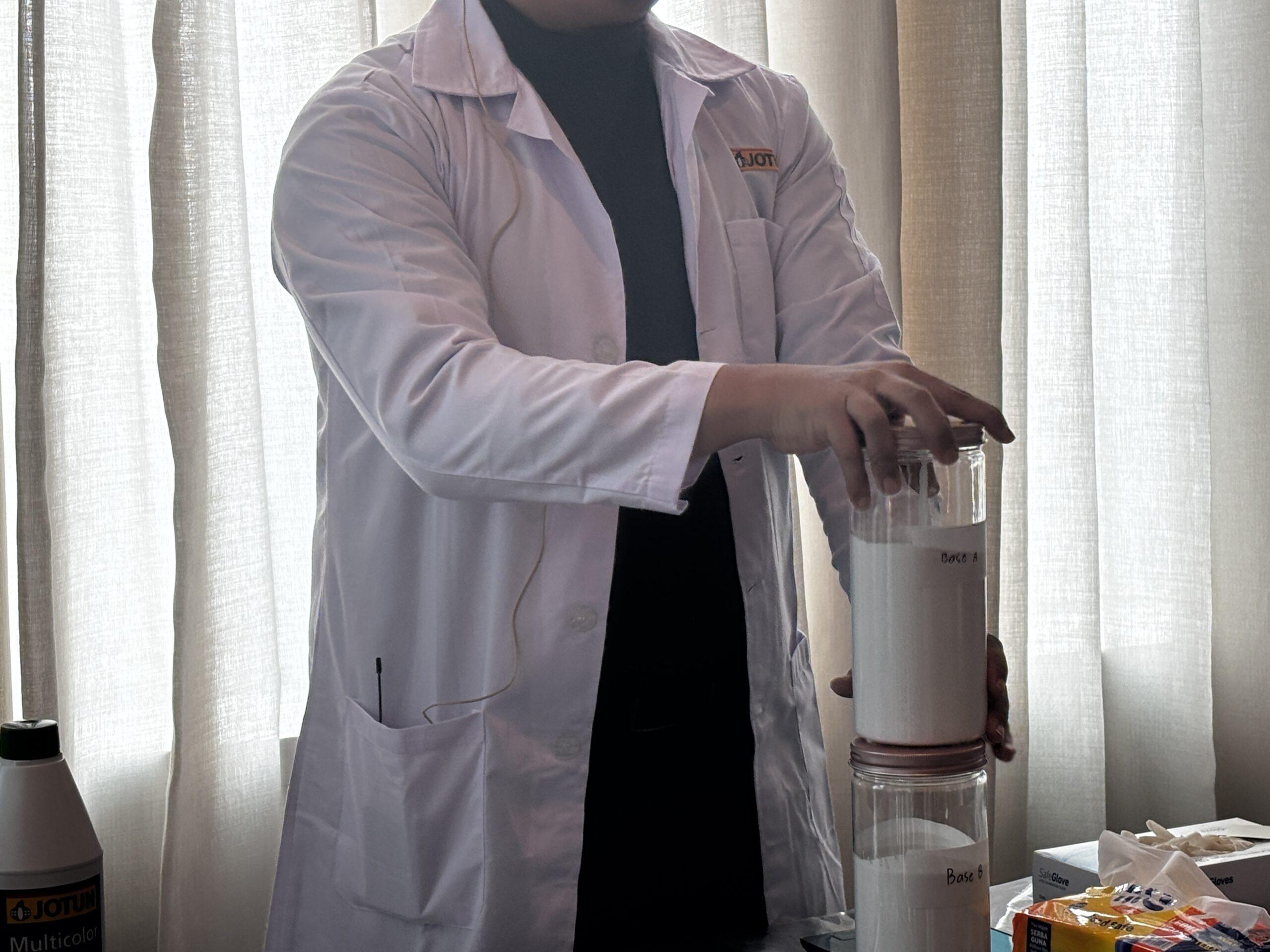
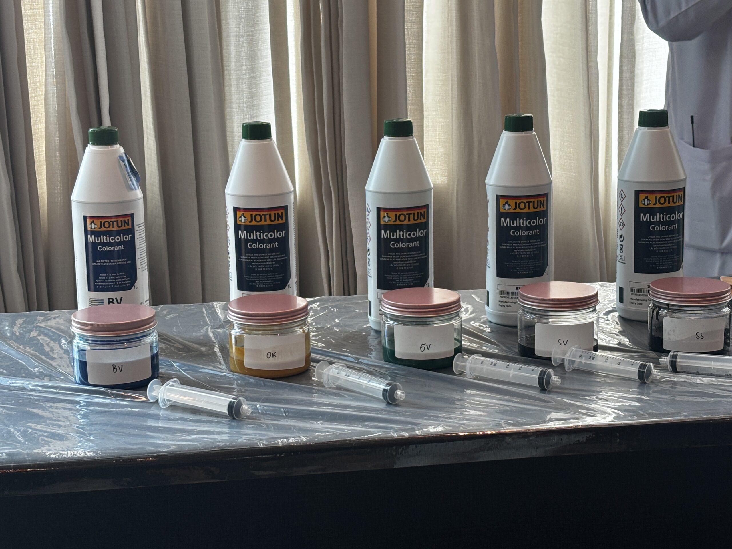
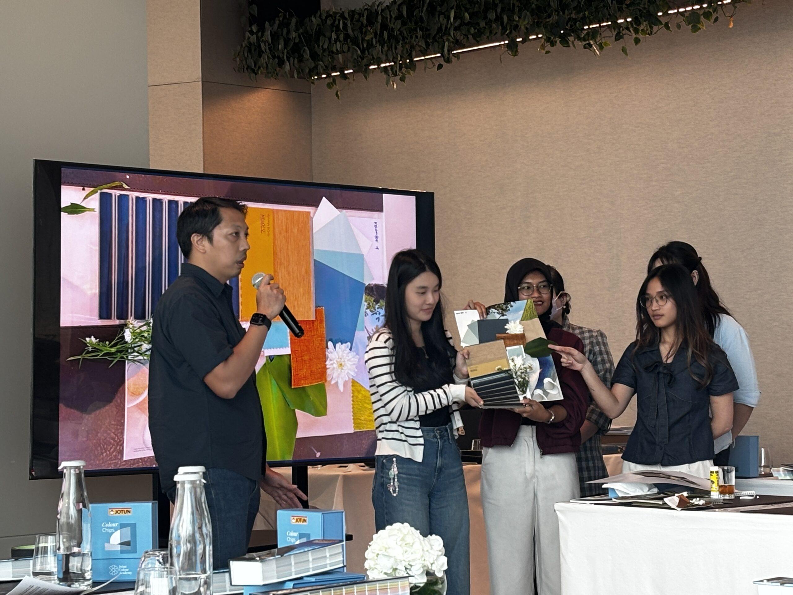
Then came the hands-on hours. Guests arranged hue-difference gradients, mapped colour resemblances around the NCS wheel, mixed secret greens and greys at the tinting station, and picked up a brush to paint their own bedroom scene on canvas. In groups, teams built moodboards for an imagined Bali villa — choosing palettes, textures, even a client persona — before presenting their stories under the banner“Design Your Space.”
Moodboard Presentation
By five in the afternoon, the carpets had done their job. For Jotun, the day was more than a masterclass; it was a reaffirmation of a long-standing commitment to the world of architecture and interior design — proof that behind every wall of colour lies both an art and a science worth learning.